

© 2023 by the authors. Published by Michelangelo-scholar Publishing Ltd.
This article is published under the Creative Commons Attribution-NonCommercial-NoDerivs 4.0 International (CC BY-NC-ND, version 4.0) license (https://creativecommons.org/licenses/by-nc-nd/4.0/), which permits non-commercial use, distribution, and reproduction in any medium, provided the original work is properly cited and not modified in any way.
Share and Cite
Chicago/Turabian Style
Qiong Li, Jiawei Wu, and Miao Yi, "Research on Urban Brand IP Design - a Case Study of “YELLOWFLOWERS” in Shangrao City of Jiangxi Province." JDSSI 1, no.2 (2023): 1-16.
AMA Style
Qiong Li, Jiawei Wu, and Miao Yi. Research on Urban Brand IP Design - a Case Study of “YELLOWFLOWERS” in Shangrao City of Jiangxi Province. JDSSI. 2023; 1(2): 1-16.
References
1. Qian Xu, “Research on the Innovative Design of Quzhou City Brand IP Based on Confucian South Descendant Culture” (M.A. thesis, East China University of Science and Technology, 2020). [cnki]
2. Wanying Li, “The Development Strategy of Brand IP Cross-Border Marketing,” Research on Transmission Competence 1, no. 10 (2017): 246. [cnki]
3. Zhijun Li, “IP-ization of Brands,” China Fashion, no. 12 (2018): 72-73. [cnki]
4. Xinhui Wang, and Meng Li, “Research on IP Strategy of Time-honored Brand WU Yu Tai,” Journal of Henan Institute of Education (Philosophy and Social Sciences Edition) 40, no. 1 (2021): 65-67. [cnki]
5. Zhiqin Hu, “The Construction and Communication Design of Liangzhu Culture Brand IP” (M.A. thesis, Zhejiang University, 2019). [cnki]
6. Shaofeng Chen, “The City IP and City Brand Strategy,” Voice & Screen World, no. 9 (2018): 21. [cnki]
7. Qiji Ma, “Several Considerations on Developing Urban IP,” Hangzhou, no. 11 (2019): 16-17. [cnki]
8. Lei Zhu, and Jinquan Dong, “On the Reasons for the Popularity of Kumamon and lts Reference to the Development of Chinese Urban Brand,” Journal of Pu'er University 34, no. 4 (2018): 72-73. [cnki]
9. Xiao Chen, and Yifan Chen, “A Strategic Study on Role IP Artistic Incubation—Taking Kumamoto Bear in Japan as an Example,” JinGu Creative Literature, no. 35 (2021): 72-74. [cnki]
10. Rong Huang, “Research on the City Brand Communication of ‘Kumanon’” (M.A. thesis, Jiangxi University of Finance and Economics, 2021). [cnki]
11. Chenyang Zhang, “‘Looking for’ Roots and ‘Creating’ Individuality-Talking about Urban Brand Image Design from Regional Culture,” Hunan Packaging 34, no. 1 (2019): 4. [cnki]
12. Jingfei Shao, Miya Lu, and Shuxia Zhang, “The Development Approach of IP Image in Urban Brand Design-A Case Study of ‘TANGNIU’ in Xi’an,” Designs, no. 7 (2021): 77-79. [cnki]
13. Riyue Chen, “Research on the Design and Dissemination of Wuxi Urban Brand IP Image,” Public Communication of Science & Technology 14, no. 5 (2022): 73-75. [cnki]
14. Yang Liu, Ling Wang, Zhen Xie, et al., “Innovative Design Method of City Brand Image,” Packaging Engineering 41, no. 10 (2020): 4. [cnki]
Shangrao City Brand IP Design
Current status of urban branding in Shangrao city
Shangrao City is located in the northeastern part of Jiangxi Province, renowned as the “Land of Fish and Rice” due to its proximity to Poyang Lake. It also holds the distinguished reputation of “abounding with beautiful mountains and rare treasures” owing to its association with Sanqing Mountain, a Taoist sacred site. In China’s revolutionary history, it is a well-known revolutionary base area and the birthplace of the spirit of Zhimin Fang, possessing rich red cultural resources. Geographically, Shangrao City is situated at the junction of Jiangxi, Zhejiang, Fujian, and Anhui provinces, bordering developed provinces and cities such as Shanghai, Zhejiang, and Fujian. Its main economic indicators, including Gross Domestic Product (GDP) and fiscal revenue, have shown rapid growth, placing it at the forefront of Jiangxi Province. Its tourism industry ranks first in the province, boasting unique advantages in terms of geographical location, tourism, and economy. Shangrao is renowned as a city in Jiangxi well-suited for living, business, and tourism.
Shangrao’s urban brand construction primarily focuses on cultural and tourism branding. Taking international brands as an example, three regions in Jiangxi have successfully been selected as “World Tourism Organization’s Top 100 Tourism Poverty Alleviation Cases.” Among them is Huangling in Wuyuan, with its selected case being “Airing the Autumn in the Sun at Huangling (Scenes of drying crops, “篁岭晒秋” in Chinese),” leading the way in shared economy and rejuvenation. As for national-level brands, the tourism route “Qingwu Scenery - The Most Beautiful Journey” was selected as a national premium theme travel route in the campaign “Revived Beauty: Post-epidemic Spring Adorns the Land (“疫去春来江山多娇” in Chinese);” Wuyuan County achieved a remarkable third place in the “2020 China’s Top 100 Ecological Counties;” Huangling Village was recognized as an emblematic rural tourism development case; Sanqing Mountain Scenic Area secured a commendable second place in the province among the Top 100 5A-level scenic area brands in the country; Wuyuan County was honored as a premium sports tourism destination in China. Taking provincial-level brands as an example, Wuyuan, Sanqing Mountain, and other scenic spots have been recognized as “Jiangxi’s Popular Tourism Routes,” with Wuyuan’s “The Most Beautiful Countryside Journey” being selected as an independent route; Wuyuan County’s Jiangwan and Huangling scenic areas have been designated as the third batch of low-carbon tourism demonstration spots. Currently, the total number of tourism brands in Shangrao City has surpassed four hundred, making it the top-ranking province in both quantity and quality in Jiangxi.
In recent years, the Jiangxi Provincial Party Committee has shown unprecedented support for the development of Shangrao. It has issued a series of opinions to bolster the expansion of open cooperation and accelerate development in the northeast region of Jiangxi. These opinions explicitly outline the vision of positioning Shangrao as a crucial growth pole in eastern Jiangxi, significantly enhancing its strategic significance. Simultaneously, implementation plans have been introduced to revitalize and develop the former Central Soviet Areas in southern Jiangxi and promote tourism as a key aspect of provincial development. Alongside the deepening progress of the “Integration of Nanchang and Jiujiang, with Nanchang as the core” (“昌九一体化、南昌核心” in Chinese) development strategy, these efforts have become catalysts and driving forces for the rapid advancement of Shangrao. Among them, in the Shangrao City General Urban Plan (2016-2030), it is pointed out that the strategic goal of “Scenic Shangrao” should be achieved at an early stage, to develop Shangrao into a Garden City with picturesque and abundant tourist destinations. Concurrently, efforts will be dedicated to constructing advantageous industrial clusters to drive economic growth and improve living standards. The general urban plan identifies three key urban characteristics for Shangrao: a renowned tourist city with international influence, a central city and transportation hub at the junction of four provinces, and a deputy center in Jiangxi province.
However, the cultural and tourism industry in Shangrao still faces some structural shortcomings. Foremost among them is the lack of a unified urban brand that can encompass various characteristics of Shangrao and represent the city as a whole with an IP image and symbol. This has led to a situation where outsiders only see individual features but fail to grasp the bigger picture. When people mention the most beautiful countryside, many think of Wuyuan; when natural landscapes are brought up, Sanqing Mountain and Wuyi Mountain come to mind; and when red tourism is discussed, Zhimin Fang is widely known. However, people often fail to realize that all these resources fall within the jurisdiction of Shangrao. Additionally, there are structural issues such as significant differences in the popularity of Wuyuan’s canola flowers between peak and off-peak seasons, low efficiency in tourism industry land use, inadequate self-sustaining capability, financing difficulties, and intense homogenous competition. These problems, to a certain extent, impede the realization of goals such as making Shangrao a “Jiangxi tourism icon and national benchmark” and “a key destination, distribution center, and transit hub in the East China region.”
Therefore, it is necessary to utilize new concepts and technologies of the Internet era, from the perspective of comprehensive development, to further strengthen and refine the Shangrao urban brand. This will effectively integrate distinctive resources and promote the rational development of the IP-ization of urban brand, thereby driving the transformation and upgrading of the entire year-round, all-regional, and full-industrial chain.
Brand IP design in Shangrao city
By combing through the historical context and cultural heritage of Shangrao city, we can summarize its cultural resources as follows: “Red Culture,” represented by the Shangrao Concentration Camp and the revolutionary base areas of Fujian, Zhejiang, Anhui, and Jiangxi; “Ancient Culture,” represented by the Ehu Academy (“鹅湖书院” in Chinese) and the Huizhou (“徽州” in Chinese) architecture; “Green Culture,” represented by Wuyuan and Sanqing Mountain; and “Blue Culture,” represented by the Poyang Lake National Wetland Park and the Wannian Shennong yuan (“万年神农源” in Chinese). Based on these four major cultural and tourism elements in Shangrao, it is believed that the positioning of the Shangrao urban brand’s IP image should be designed with the fundamental concepts of “Extraction: Shangrao city’s cultural and tourism genes; Reshaping: Integration of cultural and tourism content with IP genes; and Reproduction: an IP image reflecting the unique cultural and tourism characteristics.” The IP genes referred to in this paper can be understood as the prominent features reflected by the IP itself and the audience’s first impression of it. These genes may undergo expansion or changes to some extent as the IP matures.
In the process of extracting Shangrao’s urban genes, the IP keyword collection method can be utilized to rapidly expand thinking, grasp the direction of image design, and enrich design perspectives. The key keywords for collecting Shangrao’s features mainly include twelve elements: agricultural civilization, academy culture, ecological civilization, high-tech, canola flowers, Wuyuan, Sanqing Mountain, tea culture, Shangrao Concentration Camp, folk culture, Huizhou culture, and rural landscapes. These twelve keywords can be classified and summarized into two categories based on their brand symbol characteristics: canola flowers, Wuyuan, Sanqing Mountain, Shangrao Concentration Camp, and rural landscapes possess the “signifier” characteristic of brand symbols, while agricultural civilization, academy culture, ecological civilization, high-tech, tea culture, folk culture, and Huizhou culture possess the “signified” characteristic of brand symbols.
Considering the need to design an IP image and symbol that represents the entire city and to achieve a substantial level of recognition and diffusion in the domestic market, the selection of IP keywords will focus on the “signifier” characteristic of brand symbols. Based on online research, it has been found that among the five keywords: canola flowers, Wuyuan, Sanqing Mountain, Shangrao Concentration Camp, and rural landscapes, “canola flowers” is the one that establishes a closer connection with users and best represents the image of Shangrao city. Every March, the golden sea of canola flowers in the ancient Huizhou architectural complex at Huangling provides a strong sensory impact to visitors stepping out into early spring, leaving a profound visual impression. “Canola flowers” possess the most appealing “signifier” characteristic, drawing people’s attention and prompting them to know more about Shangrao as a city. Therefore, we ultimately select canola flowers as the fundamental design element for the Shangrao urban brand IP.
Introduction
“IP” is the abbreviation for Intellectual Property. According to the World Intellectual Property Organization’s “WIPO Convention,” it is defined as “the rights derived from intellectual creative activities in the industrial, scientific, and literary or artistic fields.” In a narrow sense, IP refers to the property rights enjoyed by rights holders after creating intellectual works, commonly translated as “intellectual property.” In a broader sense, IP encompasses the outcomes and content that are recreated, reinterpreted, and accepted by the market. It serves as the creative source of any form of cultural product, reflecting the underlying values and perspectives on life. In the virtual realm, the widely-used concept of IP not only represents intellectual property but also expands to become a medium for consolidating user emotions, increasing market demand, and enhancing commercial value, evolving into a symbol that showcases popular culture among the masses.
The popularization of IP stems from consumers’ emphasis on spiritual needs and cultural satisfaction. In an increasingly competitive market, product homogenization is becoming more pronounced. Relying solely on product differentiation for brand uniqueness is no longer enough to succeed. To make a brand stand out, it is essential to meet consumers’ emotional demands, evoke spiritual resonance, and achieve the IP-ization of brands through brand contactization and emotionalization [1]. The consideration lies in how to “’re-innovate” the ways of brand culture communication and how to enhance the ability to “narrate brand stories,” elevating brand concepts to the level of values, philosophies, etc. By shaping the brand and establishing deep connections with people’s emotions and experiences, brand IP embodies values and creates cultural identity. Therefore, the IP-ization of brands goes beyond showcasing the basic functionalities of products to integrating with consumers' emotions, highlighting specific emotional and cultural elements to captivate hearts. Through alignment with values or spiritual recognition, it forges distinctive brands that attract and drive consumption.
Currently, the academic community is still at the exploratory stage regarding the “IP-ization of brands.” Research primarily focuses on case analyses of brand IP-ization and the exploration of insights and experiences related to brand IP-ization. According to Wanying Li, the early introduction of the IP concept in the animation industry mainly centered around animated characters. However, nowadays, IP has evolved into a marketing mindset, leveraging its unique content model to cater to the emotional needs of the audience. Consequently, brands need to shift towards content-oriented development and emotional transformation, which represents the embodiment of a brand’s IP [2]. According to Zhijun Li, for a brand, IP-ization is a novel approach or methodology in brand building. When a brand creates a distinct personality for itself, continuously engages in valuable interactions with users through its essence, and gains more favor and admiration from users, it becomes a part of the IP [3]. While conceptualizing and discriminating, some scholars have also analysed the strategies for constructing brand IP-ization, making commercial brand IP-ization still shape a research focus. Xinhui Wang conducted research on the time-honored brand “Wu Yu Tai” (“吴裕泰” in Chinese), providing ideas for its transformation and upgrading through strategies such as brand repositioning, designing new IP images, and enhancing interactions with consumers [4]. With Liangzhu Culture brand as the research target, Zhiqin Hu primarily reviewed the relevant theoretical aspects of cultural brand IP-ization, offered constructive suggestions, and designed and constructed the implementation path for Liangzhu Culture brand IP-ization [5].
Research on Urban Brand IP Design
Construction strategy of urban brand IP
An outstanding urban brand IP requires multiple forms of IP construction, such as empowerment, creative integration, immersive experiences, channel collaboration, and extended design. It effectively expands the IP’s extension in the dimensions of time, space, and people, integrating into different contexts and the minds of diverse consumer groups, thereby enhancing consumer desire and facilitating the realization of the urban brand. This approach ensures a genuine connection between the urban brand and people’s emotions, accomplishing the diverse dissemination of the IP, igniting the marketing value of the urban brand, and generating a propagation potential effect [6]. In this regard, it is evident that from the outset of brand IP planning, it is essential to find a point of emotional connection with consumers, forming a multidimensional, three-dimensional, and dynamic network of human life and ideas. By creating novel, differentiated urban characteristics, the construction strategy of urban brand IP can be analyzed, comprising four elements: IP positioning, IP image, IP products, and IP scenarios, all of which bestow special significance and value upon the city.
Firstly, the positioning of urban brand IP is synonymous with the positioning of the city itself, constituting a crucial component of the city’s future development strategy. It requires a profound exploration of the city’s natural resources and cultural connotations, extracting representative cultural symbols or character images that embody the city’s genes, cultural personality, and spiritual traits. This process aims to create a unique brand identity, inspiring a sense of belonging and fostering people’s identification, while enhancing the city's attractiveness, cohesion, and influence. Urban brand IP positioning encompasses both brand strategy and brand slogan. The brand strategy is developed from the perspective of urban cultural development, involving systematic research and precise decision-making to formulate innovative and forward-looking comprehensive plans and strategies that showcase novel expressions and new developments of the city’s culture. On the other hand, the brand slogan serves as a highly condensed representation of the city’s distinctive features and core brand values. It provides a fresh interpretation and interpretation of urban culture, endowing it with a new era of meaning, thereby augmenting urban brand recognition and memorability.
Secondly, the visual image of urban brand IP needs to fully embody the city’s unique and irreplaceable characteristics, encompassing its rich historical background, current traits, and future vision. It should possess uniqueness, high recognizability, and a strong sense of identification. The IP visual image is dynamic, adaptable, and progressive, combining both inheritance and development, forming a comprehensive system. It consists of two interconnected and nested subsystems: the urban brand IP identification system and the urban brand IP communication system. The urban brand IP identification system holds a central position within the urban brand, serving as the foundation for establishing other subsystems. It showcases the city’s underlying character and unique qualities, forming the basis of collective cognition and recognition. The urban brand IP communication system acts as a conduit for disseminating the urban brand, utilizing sensory methods such as visuals and acoustics to directly and compellingly convey the urban brand concept to the public.
Thirdly, IP products serve as the carriers of urban brand IP, such as a cartoon character that embodies the city’s distinct traits, acting as a perfect “touchpoint” for presenting the city’s culture and concepts. This can quickly establish an emotional connection between the city's spirit and people. Based on this foundation, a comprehensive packaging and construction of the cartoon character as a “super internet celebrity” image can be achieved. By authorizing the creation of a series of derivative products, it can generate substantial traffic, create a fan effect, and facilitate the dissemination and commercialization of the urban brand. The development of IP products for the urban brand mainly revolves around three types: derivative products, cultural and creative products, and local products. Emphasis is placed on the correlation between the products and the city’s cultural connotations to showcase the city’s unique style and distinctive essence. Leveraging the advantages of the city's creative industry resources, the goal is to create IP products imbued with the city's imprint, thus gradually forming a mature IP industrial chain.
Lastly, the dissemination of urban brand IP is founded on a three-dimensional and diversified approach, creating immersive experiences within the dynamic urban space. Through IP implementation, the city's image and spiritual traits are subtly embedded in the minds of the audience. In the era of all media, the dissemination of urban brand IP unfolds in increasingly diverse scenarios, enabling the audience to become direct participants, experiencers, and endorsers of the urban brand IP. They perceive the city’s imagery and characteristics comprehensively and multi-sensorial, thereby deepening their memory and identification with the urban brand and its culture. By focusing on city-centric topics, a two-way dialogue bridge is constructed between humans and the city. City promotional videos foster identification and resonance. Short video platforms are employed to build momentum and convey the city’s inherent spirit. City landmark cultural events evoke emotional experiences, enriching brand memory and identification. In this manner, a myriad of forms establishes a rich array of urban brand IP dissemination scenes [7].
Analysis of Urban brand IP design
In the realm of urban brand IP design, one of the most well-known examples is Japan’s Kumamoto Prefecture’s IP: Kumamon (“くまモン” in Japanese). According to statistics, the number of different merchandises applying for Kumamon brand IP authorization has surged from 3,600 items in 2011 to over 20,000 items. Based on calculations by the Bank of Japan, the period from Kumamon's inception in 2011 to 2013 brought about 124.4 billion Japanese yen (approximately 7.63 billion Chinese yuan) in revenue for Kumamoto Prefecture [8].
In the urban brand IP identification system, designers based their creations on the black bear prototype. Originally giving a fierce impression, the designers mitigated the negative aspects of the black bear while preserving its positive features of furry and adorable appearance. They also humanized the image by using curves and arcs, imbuing the character with a friendly and cute demeanour. Combining regional characteristics is the prominent feature of Kumamon, which reflects in its colour composition. The main colors selected are black, representing Kumamoto Castle, and the blush red that symbolizes Japan’s “Moe (cuteness, “萌え” in Japanese) Culture”. Circular blushes are used on the overall black-themed image, enhancing its memorability and recognition. Moreover, as Kumamoto Prefecture is known as the “Land of Fire,” the red color also represents the flame. Another distinctive feature of Kumamon’s image is its use of a neutral expression, which exudes a sense of naivety, reducing psychological barriers for people and making it more easily accepted. Furthermore, the neutral expression also provides the audience with more room for imagination and creativity. In the urban brand IP communication system, Kumamoto Prefecture has constructed a novel communication scenario for Kumamon. By appointing Kumamon as an official civil servant, the prefecture blends the two-dimensional world with reality, breaking the barriers of time and space. As a mascot civil servant, Kumamon exhibits a more down-to-earth character. Engaging in various public antics, mischievous behaviors, and playful pranks, it portrays an ordinary person wearing a “bear” cloak, thereby highlighting its distinctive personality traits [9].
“Kumamon” has become the urban brand promotional carrier and identification symbol of Kumamoto Prefecture. It not only serves the purpose of conveying the city’s image but also conveys the connotations and significance inherent in the external representation of the urban brand image [10]. Through this image, one can fundamentally analyze the design content of the urban brand IP, which includes three aspects: intrinsic form, color coordination, and emotional setting.
Through this image, one can fundamentally analyze the design content of the urban brand IP, which includes three aspects: intrinsic form, color coordination, and emotional setting.
Firstly, intrinsic form. The Swiss linguist Ferdinand de Saussure pointed out that symbols mainly consist of two meanings: “signifier” and “signified.” The “signifier” typically refers to tangible and existentially meaningful objects in the city, such as surface buildings, representative colors, and local specialties, which are objectively present. On the other hand, the “signified” represents the connotations and spiritual aspects embedded in the urban brand, often bearing abstract meanings. It involves incorporating local history, culture, and legendary stories into everyday activities to facilitate association and quickly gain public recognition and acceptance [11]. Therefore, urban brand IP design typically possesses characteristics such as uniqueness, correlation, high recognizability, expandability, interactivity, and visibility. Additionally, it must encompass symbols representing the urban brand’s concepts, urban spirit, and cultural customs. To enhance memorability, during the design process, the image can be highly abstracted, presenting a visually concise beauty to achieve the design effect of “less is more.” Moreover, the simplicity of the design allows for greater expansion possibilities during later promotional applications. Building upon this foundation, adding human-like actions and emotions to abstract urban images can also make the city IP image more appealing and approachable [12].
Secondly, color coordination. The color coordination of urban brand IP is one of the ways to transform the abstraction and conceptualization of the city into a concrete and realistic representation, possessing the attribute of conveying the “signifier” of the urban brand symbol. Audiences comprehend the basic information and functional positioning conveyed by the urban brand IP through colors, which elicits certain associative significance concerning local cultural customs, cultural relics, historical sites, and culinary landscapes. “Kumamon,” through the facial "blush" and body “black” as “signifier” attributes, directly reflects objective representations of Kumamoto Prefecture, such as red agricultural products, folk songs, volcanic landscapes, and urban architecture. Therefore, urban brand IP needs to use a reasonable colour scheme to showcase regional cultural characteristics, tightly connecting the emotions and spirit of residents to the city. During the design process, the overall color relationship should be determined based on the image theme, followed by the selection of the primary color. Different colors possess differences in brightness, purity, and hue, enabling them to convey various characters and evoke distinct feelings in individuals.
Thirdly, emotional establishment. Apart from designing corresponding forms and colors, urban brand IP also requires its own narrative background and emotional setting to foster better emotional interaction with consumers. In image design, instilling human ideals and lifestyles can create affinity, enabling consumers to perceive the IP's thoughts, language, and emotions. Besides possessing human-like characteristics, a narrative background is also crucial. The living environment and developmental trajectory of the IP, the occurrence of events, and the unfolding of time and space all serve as powerful means to highlight the IP's values and universal elements [13]. Through events such as the "Lost Blush," Kumamon significantly increased its IP visibility, quickly establishing a strong emotional connection with the public and enhancing the consumer experience. Simultaneously, the audience enjoys watching Kumamon engaging in entertaining activities, such as riding a bicycle, jumping rope, performing gymnastics, and playing the New Year rice cake game. The element of surprise derived from uncertainty and contrasting factors brings freshness to the audience. Therefore, in the narrative background devised for the IP, it is appropriate to add elements of contrast and amusement to facilitate the three-dimensional portrayal of the IP image, achieving interactive engagement and commercial integration objectives [14].
Abstract
Based on IP-based urban branding, distinctive urban images are created to achieve favorable social and economic benefits. This paper establishes a four-in-one urban brand IP logic framework of “IP positioning - IP image - IP products - IP scenarios.” It thoroughly reviews the urban characteristics of Shangrao, Jiangxi province, and the Shangrao urban brand IP “YELLOWFLOWERS” (“黄花花” in Chinese). The “YELLOWFLOWERS” series of cultural and creative derivatives further introduces locally distinctive products.


Conclusion
In the context of increasingly fierce urban competition, target audience groups are paying more attention to the spiritual essence than the economic development status of a city. As a result, urban brand IP has become a beneficial approach for cities to seek development impetus. Compared to traditional branding, IP places greater emphasis on content production and possesses characteristics such as communicability, connectivity, and derivability. IP achieves value alignment by establishing emotional connections with the audience, and promoting high-quality urban development.
This article takes Shangrao City as the research object and analyses the relationship between urban branding and urban brand IP to demonstrate the value and significance of creating urban brand IP. By incorporating relevant case studies, it explores innovative design methods for urban brand IP and derives the construction strategy for urban brand IP, which includes four elements: IP positioning, IP image, IP products, and IP scenarios. Eventually, the Shangrao City brand IP design is presented, featuring YELLOWFLOWERS as the core image along with a series of derivative products. The design and dissemination of Shangrao City brand IP constitute a comprehensive undertaking, encompassing not merely an artistic creation process, but also a transformation of Shangrao City's unique cultural and landscape resources into culturally significant assets with substantial commercial value and social benefits. This endows the urban brand with high value and represents a perfect display and continuation of the city's distinctive characteristics. By reinforcing the cultural essence and symbol elements, fostering collaborative development between government and institutions, and orchestrating unified multi-media communication, the advancement of the city's cultural industry will be effectively promoted, stimulating innovation and sustainable development, and accelerating the enhancement of the city's core competitiveness.
Figure 8. YELLOWFLOWERS Display Store at Wuyuan High-Speed Rail Station and YELLOWFLOWERS store in Scenic Area at Jiangwan, Wuyuan (Designed by Miao Yi)
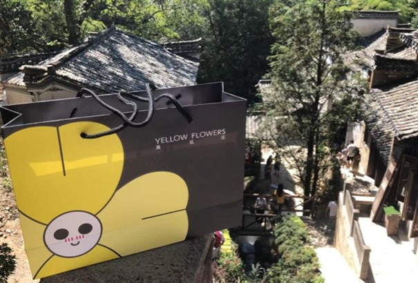
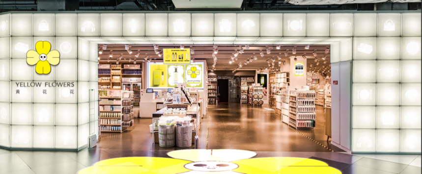
The second part involves YELLOWFLOWERS Display Store at Wuyuan High-Speed Rail Station and YELLOWFLOWERS store in Scenic Area at Jiangwan, Wuyuan (Figure 8). In collaboration with Wuyuan Tourism Co., Ltd. (a state-owned enterprise), Wuyuan Corporation has signed a strategic cooperation agreement for a duration of 10 years. Wuyuan Corporation will establish YELLOWFLOWERS franchised authorized stores in 12 of its scenic areas. The High-Speed Rail Station Display Store in Wuyuan and the 5A-rated Area Store in Jiangwan Scenic have already gained immense popularity among tourists.
The third part involves YELLOWFLOWERS-Canola Flower Research and Experience Centre (Figure 9). The experience center provides on-site perfume blending, interactive experiences, customized bottle design, and personalized packaging services. Additionally, it offers a diverse range of over 100 YELLOWFLOWERS products across nine major categories. The center adopts various business models, including educational tours and experiential consumption. Integrating self-operated derivatives, jointly authorized goods, artworks, sales, exhibitions, and displays, the YELLOWFLOWERS-Canola Flower Research and Experience Centre is dedicated to becoming a thematic hub for communication and entertainment in Shangrao City.
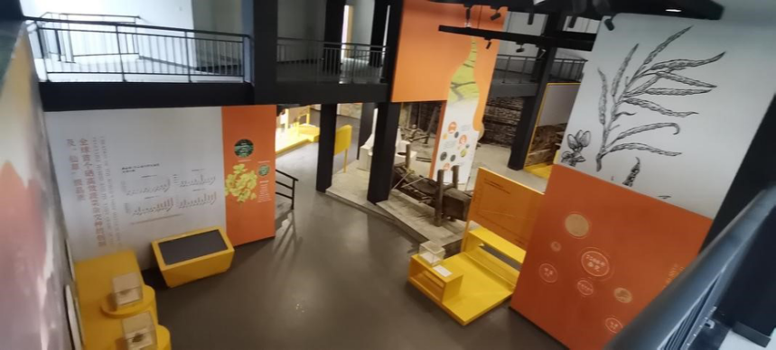
Table of Contents
- Abstract
- Introduction
- Research on Urban Brand IP Design
- Shangrao City Brand IP Design
- Conclusion
- Author Contributions
- Conflicts of Interest
- Funding
- References
Qiong Li 1,*
by
1 School of Art, Hubei University, Wuhan, China
2 Jiangxi University of Applied Science, Nanchang, China
3 One Thousand and One Nights Cultural Tourism (Beijing) Co., Ltd., Beijing, China
* Author to whom correspondence should be addressed.
JDSSI. 2023, 1(2), 1-14; https://doi.org/10.59528/ms.jdssi2023.0723a6
Received: June 27, 2023 | Accepted: July 16, 2023 | Published: July 23, 2023
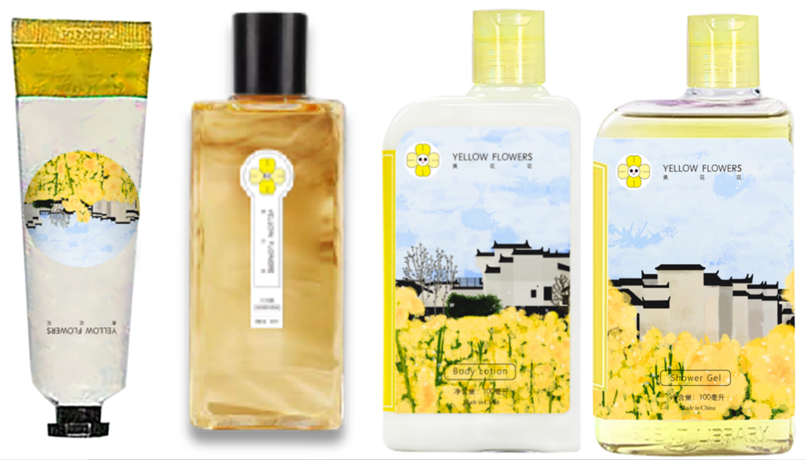
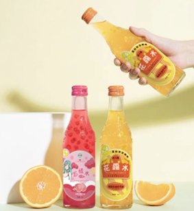
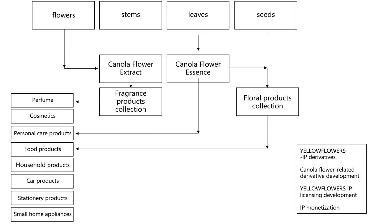
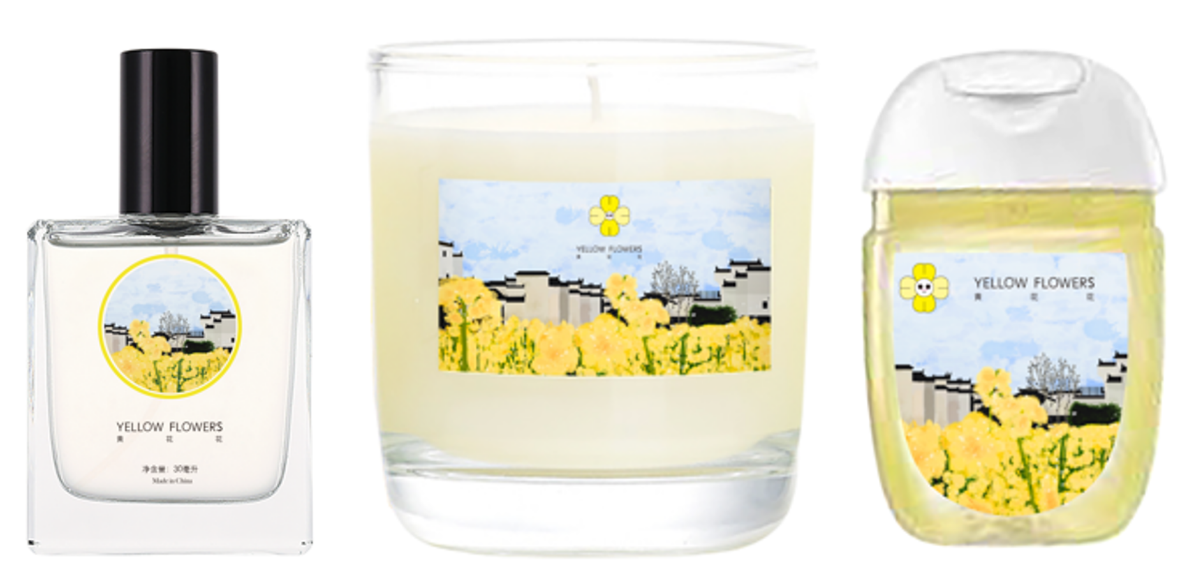
Secondly, the “cultural and creative derivative products” design series. Based on the IP image, the design of cultural and creative derivative products aims to enhance emotional interaction between the audience and the image, prompting the audience to engage in consumption behavior, thus achieving the dual enhancement of cultural and economic value (Figure 3). YELLOWFLOWERS cultural and creative derivative products can leverage the attributes of the canola flowers to design various items. For instance, the flower petals can be extracted to create canola flower extract, producing fragrant products related to YELLOWFLOWERS; the stem, leaves, and seeds can be extracted to produce canola flower essence, resulting in personal care, daily essentials, and culinary products (Figure 4, Figure 5, Figure 6).
In the process of innovative design and creative development of the Shangrao City brand IP, it is equally essential to promote the image of the Shangrao City brand IP and its cultural and creative derivative products, thereby expanding the cultural influence of Shangrao City and effectively driving the city's urban development. The dissemination and promotion of the Shangrao City brand IP can be divided into three parts.
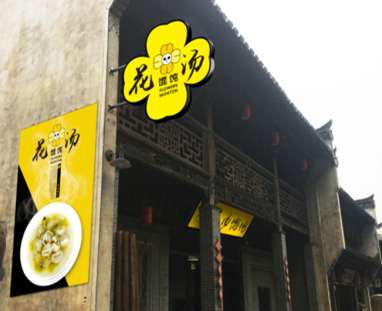
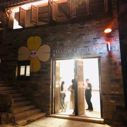
The first part involves the establishment of the inaugural YELLOWFLOWERS store in the Scenic Area at Huangling, Wuyuan (Figure 7). This includes three stages:
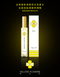
- Phase one focuses on creating internet-famous products, such as the canola flower salon perfume (fragrance).
- Phase two involves extracting canola flower essence to develop various YELLOWFLOWERS fragrant peripheral products, such as face masks, body lotion, shower gel, shampoo, lip balm, scented candles, handmade soap, and car air fresheners.
- In phase three, the focus is on developing YELLOWFLOWERS merchandise to create cultural and creative IP-related tourist souvenirs in Wuyuan.
Author Contributions
Qiong Li was responsible for paper revision and oversight, Jiawei Wu drafted the initial manuscript and was in charge of data collection and organization; Miao Yi handled brand IP design and drew the figures within the paper.
Funding
This research was supported by the National Social Science Fund of China under the Art Research Program 'Research on Cultural Innovation and Development Path of Digital Creative Industries' (Project No. 2019BH04596).
Conflicts of Interest
The authors have no conflicts of interest with respect to the research, authorship, or publication of this article.
In the specific design of the IP based on canola flowers, the shape references the “Sunflower” created by Japanese artist Takashi Murakami and the floral elements of the world-renowned Finnish brand Marimekko. The color scheme primarily adopts the “yellow” of the canola flowers, which evokes a sense of joy, hope, and vitality. This choice aligns with the character and essence associated with the cheerful yellow flowers. The complementary colors will also include hues close to the yellow and green of the canola flowers.
Thus, the first original IP of the Brassicaceae family, YELLOWFLOWERS in Figure 1(a), is born, and it will also become a fashion synonym for the Brassicaceae family. YELLOWFLOWERS may appear ordinary, but it possesses a powerful force, thus endowed with the flower language of “cheering on.” If we consider YELLOWFLOWERS as a youth, its spirit is akin to that of the seemingly ordinary canola flowers—neither arrogant for displaying brilliant golden colors when blooming nor sighing for the vast and pleasing sea of flowers. Instead, it consistently maintains a spirit of striving and cheering on diligently, pursuing its ideals. Building upon the foundational design of YELLOWFLOWERS IP, the personification of the IP can be realized. For example, the adorable version—ChubbyFlowers, dressed in baby rompers, possessing a naive character, and primarily presented in tender green hues; the female version—YellowFlowers in Figure 1(b), wearing sportswear and white sneakers, featuring a healthy and upright figure, an optimistic personality, and primarily presented in dark green tones.
Relying on the foundational design of YELLOWFLOWERS IP, additional application attributes can be extended to further strengthen the existing IP image, thus enhancing the overall design shaping power of the IP. The extension of YELLOWFLOWERS IP design can be applied to the following two series:
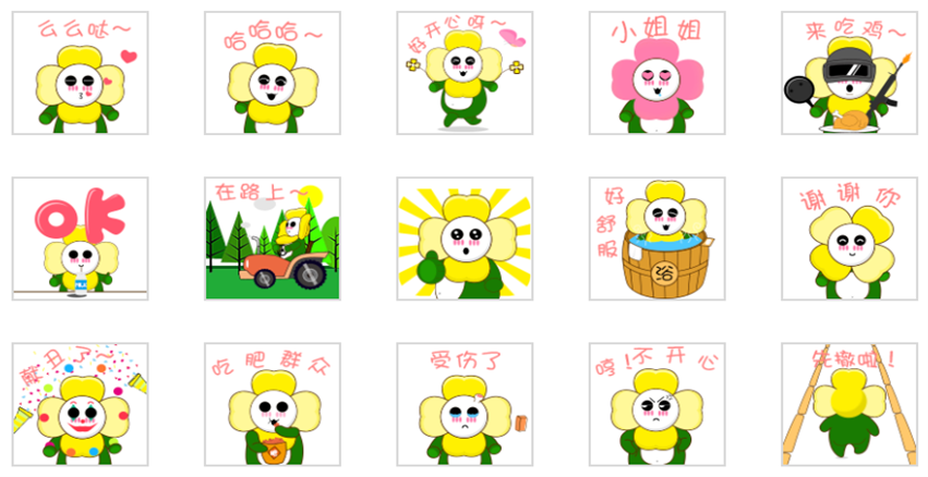
Firstly, the “emoji pack” design series. Emoji packs serve three main functions: emotional expression, message communication, and cultural dissemination. In the Internet era, users are more willing to use emoji packs to communicate about social hot topics, and the style and types of emoji packs also influence the spread of popular culture. Selecting a close-up of YELLOWFLOWERS’ head and upper body, popular emoji elements are integrated into the facial and hand movements, enhancing the personification attributes of YELLOWFLOWERS (Figure 2).
Jiawei Wu 2,
Miao Yi 3
Lates articles
Email: mspl@michelangelo-scholar.com
Tel: +852-66761250
WHATSAPP:+60 11-2370 2845
Room A, 3/F, Wing Tat Commercial Building, 121–125 Wing Lok Street, Sheung Wan, Hong Kong, China

JDSSI
MSPL
JACAC
DH
JAUD