Table of Contents
- Abstract
- Introduction
- Netnography as Methodology
- Bad Design Understood by Online Community Posts
- Bad Design Canvas
- Conclusions
- Author Contributions
- Funding
- Acknowledgements
- Conflicts of Interest
- References
The findings discussed from the thematic analysis are used to develop a Bad Design Canvas. After understanding how the concept of bad designs are perceived by the people, the canvas would be filled with criterias and evaluation checklists that is expected to help designers and design students in aiding their design system, particularly to avoid creating what might be perceived as a bad design.
In addition to investigating the characteristics of bad design from a public perspective, this paper also aims to develop a new assessment tool to evaluate existing designs, including both well-known designs and original creations. This tool is designed to assist students and designers in learning to distinguish between good and bad design. Furthermore, it will be valuable for design companies, providing a means to assess new designs before they are released to the market. By ensuring that designs do not fall into the category of bad design, companies can avoid negative public perceptions and maintain strong market interest, thereby protecting their market position and profitability.
The tool will incorporate criteria derived from our research on public perceptions and common design flaws, offering a comprehensive framework for evaluating design quality. This dual focus on education and practical application aims to enhance the overall standard of design practices and reduce instances of poorly received products.
Bad Design Canvas: Understanding Public Perception of Poor Design Practices
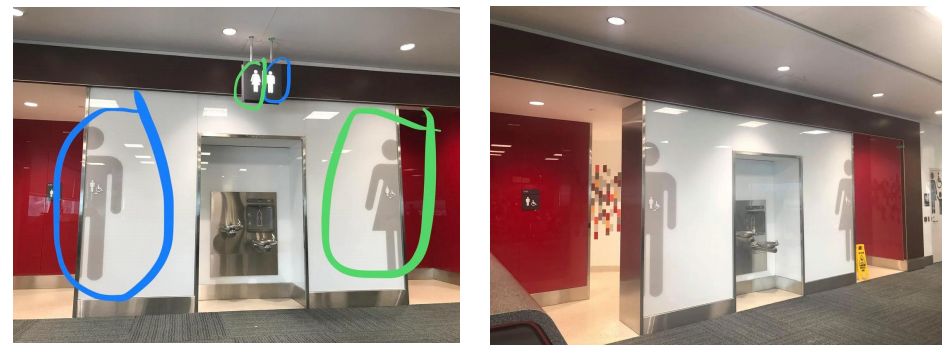
One particularly interesting case involved Toronto’s Pearson Airport in 2019 (Figure 12), where a misguided visual guide for restrooms led people to enter the wrong gender-specific bathrooms. This post went viral on Reddit, becoming one of the forum’s top posts of all time. Although the exact time frame is unclear, a subsequent update post by another user indicated that the incorrect toilet sign had been removed. It remains uncertain whether this change resulted from the viral Reddit post or due to numerous complaints, but the follow-up post celebrated it as an achievement. One commenter, claiming to be the installer of the sign, suggested that the initial Reddit post may have influenced the change, although this cannot be verified due to the anonymity of the commenter. This indicates that posts in public forums have the power to drive real-world change.
Our third community, /r/AssholeDesign, dedicated the subreddit for the community to share designs that exploits the users, where the providers of the design get the benefits at the user’s expenses. Their community description quite summed it up: “When Asshole Design Things,” their complaints were directed more at the provider of the designs, or the designers. The use of the term “asshole” instead of bad design implies the fault to be intentionally crafted to exploit the user for profits. The number one rule of the community quotes on Hanlon’s Razor, a rule of thumb that states “Never attribute to malice that which is adequately explained by stupidity.” In addition, while the unpleasant aspect may come from how the provider of the design exploits the user, the rules state how what constitutes an “asshole” design is not only from the way the company charges money for the product, but that the design must be underhanded in some way.
Compared to the previous two communities, /r/AssholeDesign’s top posts contain more various forms of designs being complained about, ranging from website system, packaging design, advertising, even government systems. The users did not shy away from blatantly directing and blaming the brand or company names from which the design was marketed from, and the posts have tones of either sarcasm or mocking towards the brand. Due to the nature of the “asshole” design that requires the user to feel exploited, sometimes the images or videos of the posts are not self explanatory and that the users need to explain how the marketed products are poorly designed.
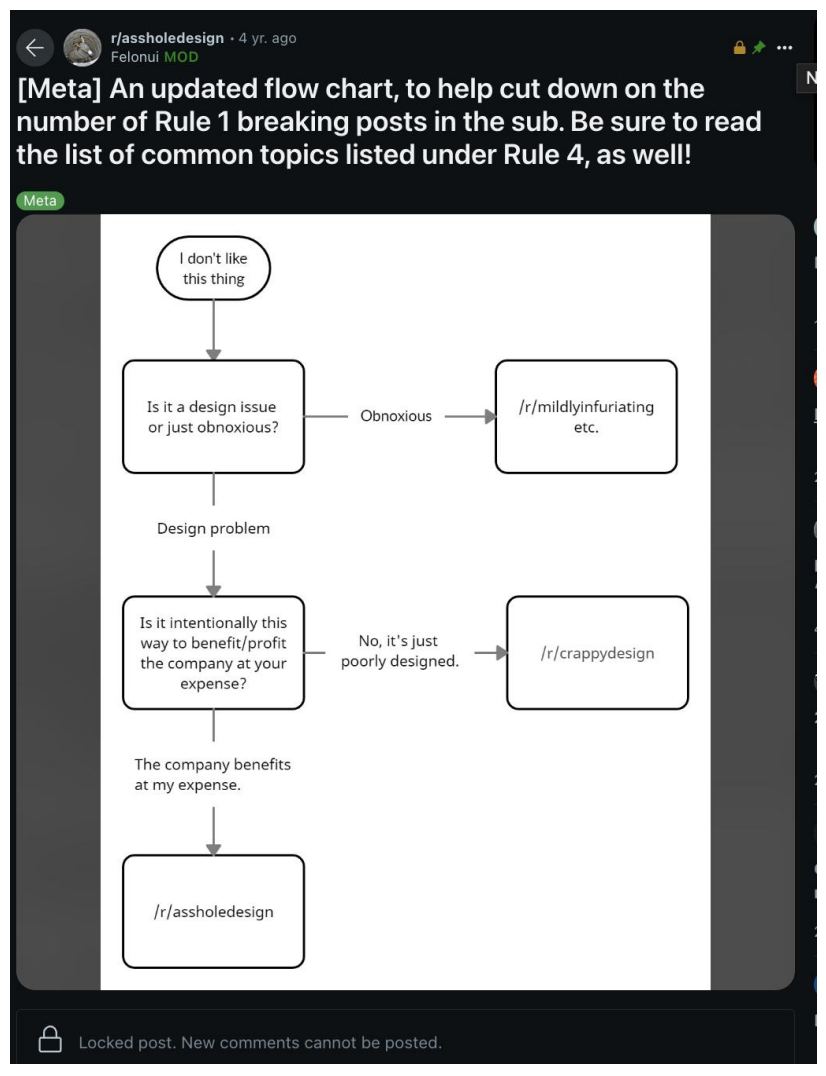
Interestingly, the moderators of /r/AssholeDesign do not only provide rules to the community, but also pinned a post which contains a flowchart to help the users decide whether a post would be suitable in the community or not (Figure 13). This flowchart further clarifies how the bad design is perceived in online communities, as they made the distinctions on which different causes or aspects of bad design in the different community. We can see how /r/CrappyDesign and /r/AssholeDesign acknowledge each other as different communities, whereas /r/BadDesign/ might be defined outside this chart (Figure 13). When something is only obnoxious yet not found within a component of a design, it would not fit into a category of bad design, and might be more suitable to be posted on another subreddit that is not specifically catered in the context of design. When the problem lies in its design, yet it is not exploitative or tries to lure the user into something they did not sign up for, it might be just categorized as a “crappy” design. However, if the user felt like they were being scammed, or that the design worsened their situation or problems instead of helping them like it was supposed to do, it might go under “asshole” design.
(source: https://www.reddit.com/r/CrappyDesign/comments/be93sn/just_watched_a_guy_go_into_the_wrong_bathroom_at/)
Bad Design Canvas
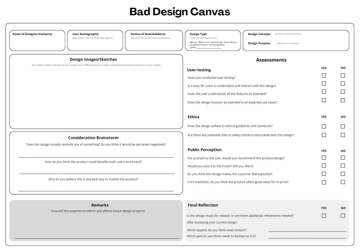
The “Bad Design Canvas” (Figure 16) is a conceptual tool designed to systematically evaluate and learn from poor design choices in various projects, mainly product design and graphic design. The canvas serves as a framework to help designers, developers, and other stakeholders critically analyze what went wrong in a design and how to avoid similar mistakes before releasing the project to the public.
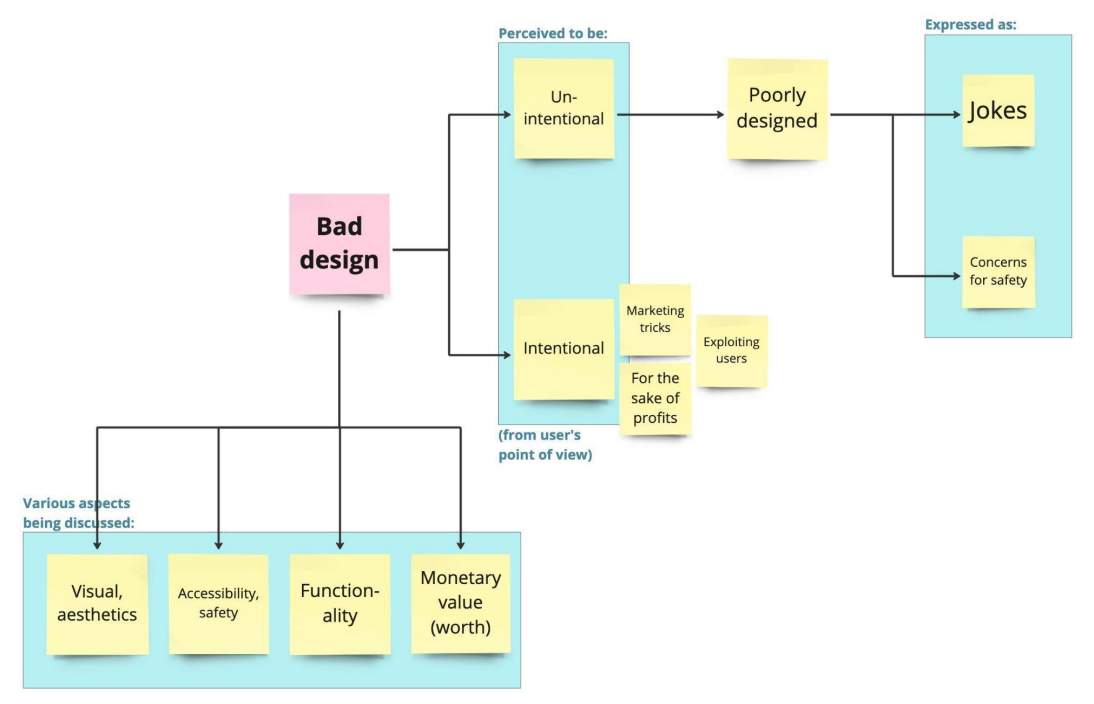
The findings have shown that the public, who participates in these online community forums, do understand the meaning of what constitutes bad design, although the understanding may vary. We could not possibly pinpoint whether these members of online community forums have actual design education background or that they pursue a design career, yet as part of a larger public we can see how they managed to create a whole community moderated by one of their own, and express their dissatisfaction towards bad designs. The forms of bad design understood by the online public also varies: from tangible industrial products, interior designs and architectures, graphic designs (logo, posters, symbols, etc), public facilities, softwares and websites, even governmental systems. Some of these users are keen to critically view the poor aspects of designs they see in their lives, where some others are simply pointing them out as jokes.
From the three subreddits explained above, we can also understand how there are two kinds of bad designs being perceived from the perspectives of the users towards the designers, creators, or the company brands, which are intentional and unintentional bad designs. Designs or systems where the users are made to feel like they are being taken advantage of are considered as intentionally designed, because they feel as if the company benefits from the misfortune of the users (or the public), whereas the unintentional bad design may just simply be a design poorly planned and/or executed, which leads the users to share and make jokes out of it. When the bad design is actually harmful or has the potential to injure someone, people would usually be more critical or empathetic about it.
Some of the intentional bad design aligns with what design researchers termed as Dark Pattern [35, 36], particularly in the field of interface or experience design field (UI/UX). It is a term to describe design choices that intentionally deceive the users and lead them to make a decision that is originally unintended, and ends up giving the user disadvantages or even harm. These are considered to be morally and ethically wrong, as it is an unfair practice giving only the company benefits but exploiting the users and customers. From our research, these kinds of complaints were mostly found in /r/AssholeDesign.
The results of the netnography also shows how the aspects being complained or pointed out from the bad designs varies. We tried to put the commonly found posts into categories that would describe them best. The most obvious aspect from a bad design might be its visual aspects that involve not only the aesthetics that relate to subjective taste of the users, but also closely related to functional aspects such as readability communicating information through symbols or visual elements. Aspects of functionality may also be pointed out when the products turn out to not give a desired outcomes or effects as it is should be. Online users have also expressed concerns about accessibility of particular designs, such as whether they would be safe to use for people with specific disorders or disabilities or not. Lastly, users have also complained about bad designs when the price charged for such design is considered not suitable with the benefits that they get as users.
From our process of analysis and coding the data gathered, we have outlined the main findings from the netnography in three subreddits into a chart (Figure 15), and we are also using this as the starting point to create a concrete framework. An actual tool centered around the concept of a bad design may be used by designers and design students to reframe their ways of thinking and to see their own creation in a different perspective, using a different lens that may allow them to think like how the public would react when they see a bad design.
Introduction
Design is a ubiquitous element that significantly impacts our daily lives, influencing our interactions, activities, and overall well-being, shaping our interactions and experiences with the world around us. Good design enhances user experience by making products and services more enjoyable and easier to use, while poor design leads to frustration, inefficiency, and dissatisfaction. Well-designed products and environments, such as ergonomic office furniture and intuitive kitchen layouts [1], improve how we perform tasks, boosting productivity and reducing physical strain. Similarly, aesthetic design is significant in enhancing visual appeal and comfort [2, 3]. Interior design, for instance, creates inviting and pleasant living spaces [4], while fashion design combines style with comfort [5]. Well-designed products and environments add economic value by attracting consumers and enhancing productivity [6].
Numerous design awards around the world focus on recognizing and celebrating well-designed creations. The “Good Design Award” is a prestigious recognition that signifies excellence in product design. Winning products are known to evoke emotions in users and convey a sense of quality through their design [7]. Studies have shown that companies receiving design awards tend to perform better financially, indicating a positive correlation between design recognition and business success [8]. Additionally, international design awards play a key role in conferring symbolic knowledge within the design field and enhancing the reputation and competitive advantage of product design firms, as they are instrumental in defining and disseminating standards for what constitutes good design [9, 10, 11].
Design competitions like the Good Design Award, alongside other renowned design competitions such as the Red Dot Design and iF Design awards, provide a framework for evaluating design excellence based on criteria such as creativity, originality, and adherence to industrial design principles [12, 13]. Furthermore, the significance of design awards extends beyond mere recognition, as they contribute to the social value of products and companies, influencing consumer perceptions and market positioning [14].
A good design is often distinguished by its ability to resonate with professionals who possess a keen eye for aesthetics, functionality, and innovation. But unlike the recognition accorded to good design, there is absence of an “award” specifically dedicated to bad design. The term “bad design” is commonly used by both professionals and the general public to critique designs that cause discomfort, confusion, or pose safety risks. This widespread recognition has given rise to the term “bad design,” a concept used liberally across both design-specific and non-design contexts. Bad designs can arise due to several factors, including insufficient attention to detail, inadequate feedback, increasing complexity, and poor operational visibility, among others. Design failure is also likely to occur if the designers recommend low-cost materials to lower the initial construction cost [15]. According to Robert Grudin [16], bad design mainly results from 3 factors namely ignorance, poor socioeconomic resources, and skewed professional priorities. Often, these design flaws cause user frustration, improper use, or abandonment of the product [17]. Bad design is sometimes referred to as crappy design, design fails, tragic design, and other contemporary terms by the general public.
Several notable bad designs released by major companies have faced significant criticism over the years. The examples include Apple’s Hockey Puck Mouse, Microsoft Bob, and Tesla Cybertruck.
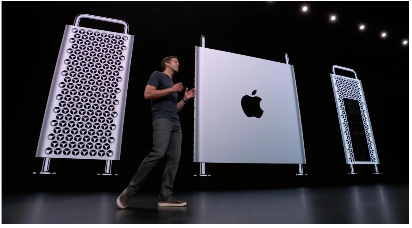
A particularly notable video from this series focused on posts from r/crappydesign, including a review of the 2019 Apple Mac Pro (Figure 5). PewDiePie critiqued several aspects of its design, pointing out issues such as an oversized logo, impractical wheels, and the design of the side panel which was intended for air circulation. These critiques not only garnered widespread attention but also contributed to the broader conversation about design quality and functionality in contemporary products.
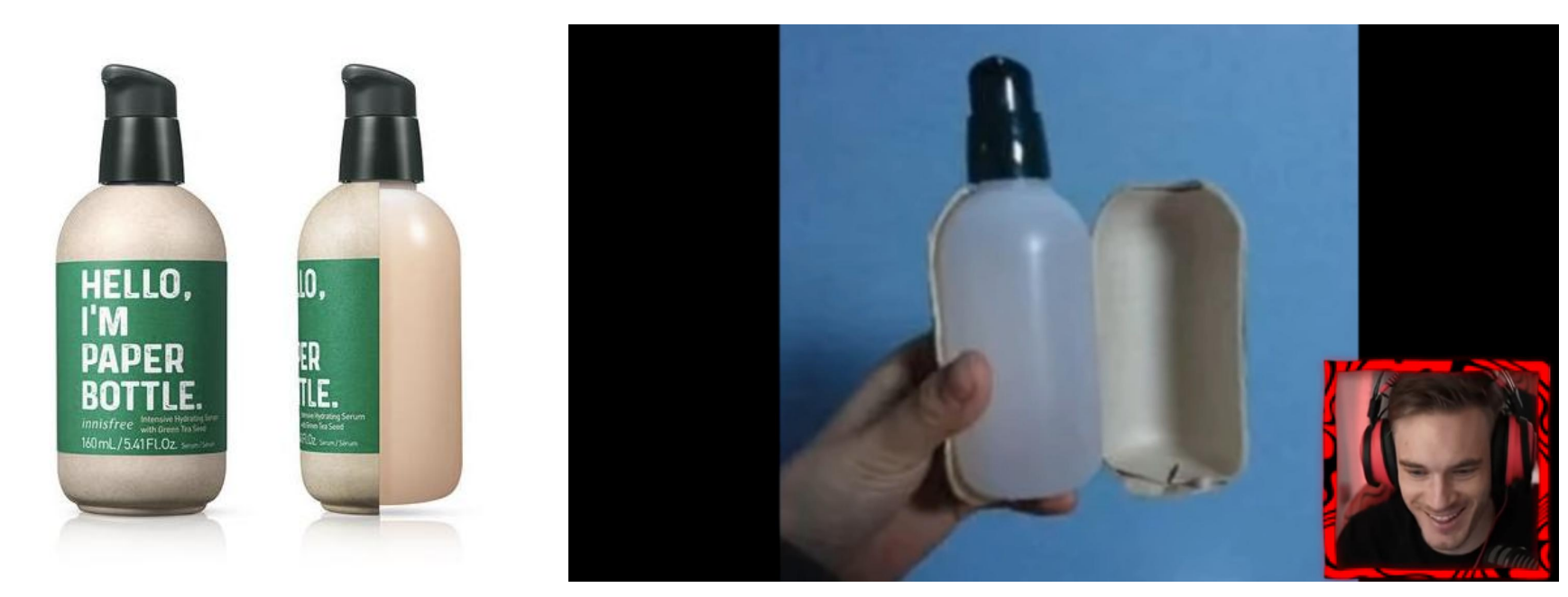
Another notable video from PewDiePie’s series on r/baddesign discussed the packaging design of Innisfree, a makeup and skincare brand from Korea (Figure 6). The packaging prominently featured the statement, “Hello, I’m Paper Bottle,” in large font. However, when the paper layer was torn away, it revealed a plastic bottle underneath. The design intention may have been to facilitate easier recycling, as unprinted plastic bottles are more recyclable compared to printed ones [27]. Beautypackaging.com reports that Innisfree clarified their use of the term “paper bottle,” explaining that it refers to the paper label that wraps around the actual bottle. While this approach may have sustainability intentions, it can be viewed as an example of greenwashing, where the packaging design misleads consumers by creating a false impression of environmental friendliness [28, 29]. This case emphasizes the importance of transparency and honesty in product packaging, especially in the context of sustainability claims.
Share and Cite
Chicago/Turabian Style
Savira Aristi, and Virliany Rizqia Putri, "Bad Design Canvas: Understanding Public Perception of Poor Design Practices." JDSSI 2, no.4 (2024): 33-52.
AMA Style
Savira Aristi, and Virliany Rizqia Putri. Bad Design Canvas: Understanding Public Perception of Poor Design Practices. JDSSI. 2024; 2(4): 33-52.
© 2024 by the authors. Published by Michelangelo-scholar Publishing Ltd.
This article is published under the Creative Commons Attribution-NonCommercial-NoDerivs 4.0 International (CC BY-NC-ND, version 4.0) license (https://creativecommons.org/licenses/by-nc-nd/4.0/), which permits non-commercial use, distribution, and reproduction in any medium, provided the original work is properly cited and not modified in any way.
Overall, we can see how across the different communities there are similarities of what is perceived as a bad, poor, crappy, “asshole,” obnoxious, and other similar negative adjective attributed to a bad design, and how these bad designs may take different forms of products and systems. The discussions on the platform also include poorly designed products that lead to misunderstandings and misuses from the users. We can identify the patterns of how they discussed it: the online users can judge bad designs not only from the physicality or the function of the design itself (e.g. ergonomic components, readability of texts, not so pleasing visual aids, uses of colors to symbolize meanings, among others) as well as things beyond it, such as the way it is marketed and advertised to its users or its to-be users, as well as errors on technicalities that might be overlooked when the designers planned the original design. Not only do they understand what constitutes a bad design, they also share and discuss it on the internet. Many of the designs posted are treated as a joke, or have mocking tones to it, as shown on the description of /r/BadDesigns subreddit’s description (Figure 14). Some other posts express genuine concerns over bad designs that have a potential harm to its users, while others articulate their disappointment and complaints over bad designs that they experience firsthand. There are also users who reposted content from other social media and shared it on those particular subreddits, meaning that they had never actually experienced it themselves but are just resharing what they found across different platforms on the internet.
Netnography as Methodology
To untangle the concept of bad design and to answer the objectives outlined above, we are using netnography as the methodology. It is a methodology that adopts anthropology’s approach of ethnography, conducting immersive observation in a certain community, particularly on the internet [30, 31]. In the context of this research, we simply observe and take notes of the behaviors of the online community, without performing any direct intervention or interaction with the online community members. Through a critical analysis of the posts visible online, the goal is to understand how people, regardless of their background–whether they are designers or literate in design - judge and perceive what is a bad design. Other synonyms for “bad” in the context of bad design may also include other phrases that would express disappointment towards a design.
In defining the boundary of our “field” site, we selected Reddit as the platform where we perform the netnography. Reddit has divided its threads and conversation posts into subreddits, specific community groups where they have their own topics and rules on what is acceptable to be posted on specific a subreddit. A user who has joined the community may make a new post to start or trigger a discussion, and other users may comment and create different threads out of the main post. Subreddits are also moderated by Moderators (Mods), who may moderate or even delete posts and comments when they are deemed violating the rules of the subreddit. Mods are users themselves, volunteering to regulate the community for a conducive discussion online environment.
For this research, three subreddits were particularly chosen: /r/BadDesigns/ (https://www.reddit.com/r/BadDesigns/), /r/CrappyDesign/ (https://www.reddit.com/r/CrappyDesign/), and /r/AssholeDesign (https://www.reddit.com/r/AssholeDesign/). Evident from the title of the subreddits, they contained posts in which we try to untangle: the concept of bad design perceived by the people. In addition, most of the users who post on reddit do it anonymously, and we expect more raw or unstaged, “natural” insights and information from these kinds of posts. In observing the posts made, we filtered the posts and sorted them using the “Top” posts option of “All Time,” meaning that the first posts shown would be the ones gaining the most interactions such as views, comments, and likes, of all time throughout the subreddit. The netnography was conducted in August 2024 over a two-week period. This brief timeframe was chosen based on the author’s decision to utilize the “All Time” top posts feature, which includes all posts made since the subreddit’s inception. This feature enabled the author to collect a large dataset within a condensed time frame, making the netnographic study efficient. Additionally, the work of Quinton and Harridge-March [32] emphasizes the flexibility of netnography as a method for studying online communities. They note that netnography allows for the collection and analysis of data over varying durations, which can include shorter periods of observation.
With a large and active membership, this community serves as a hub for users to share images and stories of designs that are impractical, confusing, or simply aesthetically unpleasing. Posts range from everyday items with functional flaws to public infrastructure projects that fail to meet user needs. Members often engage in lively discussions, analyzing why a particular design is ineffective and occasionally suggesting possible improvements.
Using netnography, the expected result is to understand how bad designs are understood, including the different aspects and trends that arise from the community. The data gathered online will be analyzed holistically using thematic analysis method [33, 34], as we identify patterns of themes emerging from the various posts and comments across the three different subreddits. The process of analysis and data gathering is recursive, requiring us to move back and forth between the raw data and the analysis produced from discussions among the authors. The output of the analysis will also include a map that explains the patterns of themes found within the subreddit (Figure 7).
Bad Design Understood by Online Community Posts
The first community that we studied was /r/BadDesigns. Despite the name of the subreddit that is self-explanatory, the moderators of the community have also provided a guideline of the things acceptable to be posted on the subreddit, or, in other words, have defined what is considered as a bad design (or not).
The first rule was that the post must contain a designed item that should have utilized the Engineering Design Process and/or Industry Best Practices, while linking the Wikipedia pages of the two terms mentioned. This clearly delineates the types of “design” that could be included in community posts. The second rule mentioned how the design should have a negative unintended consequence, followed by how it has to be an active decision by someone (i.e. the designer), not an error or mistake. Lastly, the bad design should not be a biased opinion of the user who posted the bad design.
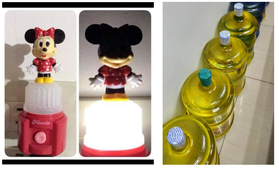
Sifting through the Top posts sorted according to All Time period, the popular posts on /r/BadDesigns contained the type of design that relates to graphic or visual aspects of a design, e.g. colors, fonts, icons or logos, size of text, as well as the type of words used on the design (Figure 8). By the time this manuscript is written, the number one top post in this subreddit, with 403 comments and more than 7000 karmas (points acquired from calculating the number of upvotes minutes the downvotes), is a post complaining how the new logo of X (formerly Twitter) have a similar character with how one would normally perceive porn sites or application. Other posts include submission of bad designs in the form of toys (Figure 9), fashion, interior, or public facilities, but we noticed how the bad designs that appear in the more graphic and visually were more commonly found.
This research in public forums reveals that the notion of “bad design” is not uniform. Some designs are deliberately crafted to be unconventional, while others unintentionally result in bad design. This study aims to investigate the public’s perception of bad design, classify various forms of bad design, and their defining characteristics. This research also focuses on the public’s understanding of design and the aspects that commonly attract criticism. By examining these forums, we aim to understand the broader implications of bad design and contribute to the discourse on design quality and user experience.
The objective of this paper is to elevate the knowledge derived from the community, bridging the gap between academics, professionals, and the public. In this introduction, we discuss well-known designs among designers and the public. However, it is important to note that many lesser-known designs often receive criticism in various forums. These designs may include small details that are sometimes overlooked by designers but are noticed by the public. This research highlights the “knowledge” of the community, bringing attention to the often overlooked but valuable insights that emerge from public discourse.
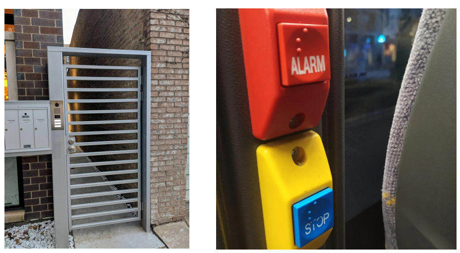
The second community we researched is r/crappydesign, a Reddit forum similar to r/baddesign, where users primarily post examples of misunderstood or poorly executed designs (Figure 10, Figure 11). Upon reviewing the top posts of all time, we found that the content predominantly features designs with bad visual aesthetics, those that endanger users, and poorly placed objects. The r/crappydesign forum is governed by 25 main rules that outline what does not belong in the subreddit. Notably, the exclusions include designs by amateurs, manufacturing defects, off-brand products, typos (which belong to other forums), small products sold in large packages (often intended to be easier to handle, more visible, and less prone to theft), and signs or posters resembling eye charts (which are designed to attract attention and cause people to pause to read the message). Moreover, the forum excludes outdated designs and designs that are considered normal in other cultures.
Abstract: Design and its complexity are understood differently by the public. It is everywhere in our everyday lives, people without a background in design education may also differentiate poor designs. Consequently, the term “bad design” emerges. “Bad design” is loosely used, extending from design-specific to non-design fields. However, there is yet to be a universally accepted academic definition of what constitutes bad design. Why do bad designs exist? How do bad designs become distributed and adopted by the public? Adopting netnography methodology, this study involves gathering samples of public opinions on bad designs from internet forums in Reddit. The first objective of the research is to untangle the concept of bad design that may stem from intentional or unintentional causes. Unintentional—due to the designers’ negligence—or intentional, to benefit certain parties. The study reveals that public posts often highlight design failures across various fields—ranging from industrial products to government systems—focusing on aesthetic flaws, poor functionality, and exploitative “dark patterns.” Regardless of the causes, bad designs have the potential to result in harm, whether to their users, the environment, or the business sector, disadvantaging certain groups or stakeholders. Considering these aspects, our second objective is to develop a tool to identify bad design elements.
“Bad Design Canvas” is devised as a suggested tool to assess and rethink our current design practice, to be more mindful. This canvas holds the potential to be beneficial for designers and design students in identifying deficiencies and evaluating existing bad designs. The values of good design may be easier to be recognized by designers or professionals in the design field, whereas bad designs can be noticed by the public as users. While it may not be possible to eliminate bad design completely, it is the responsibility of design practitioners to recognize and minimize its occurrence in their practices.
by
Savira Aristi 1*,
1,Virliany Rizqia Putri 2
1 Graduate School of Science and Engineering, Chiba University, Japan
2 Graduate School of Human and Socio-environmental Studies, Kanazawa University, Japan
* Author to whom correspondence should be addressed.
JDSSI. 2024, 2(4), 33-52; https://doi.org/10.59528/ms.jdssi2024.1220a26
Received: August 18, 2024 | Accepted: October 24, 2024 | Published: December 20, 2024
Apple’s Hockey Puck Mouse - Product design
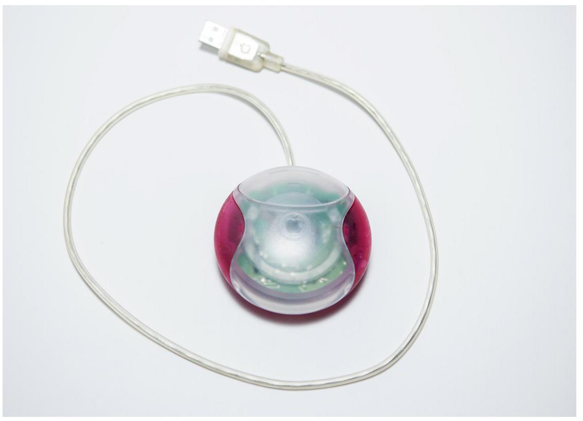
Apple’s “Hockey Puck” Mouse (Figure 1), officially known as the Apple USB Mouse, was introduced in 1998 alongside the original iMac G3. While it was innovative in its aesthetics, it quickly became infamous for its poor design and user experience [18]. The Hockey Puck Mouse marked a shift in Apple’s design philosophy under Steve Jobs’ leadership. The iMac G3 was celebrated for its colorful, translucent design, and the mouse was intended to complement this aesthetic.
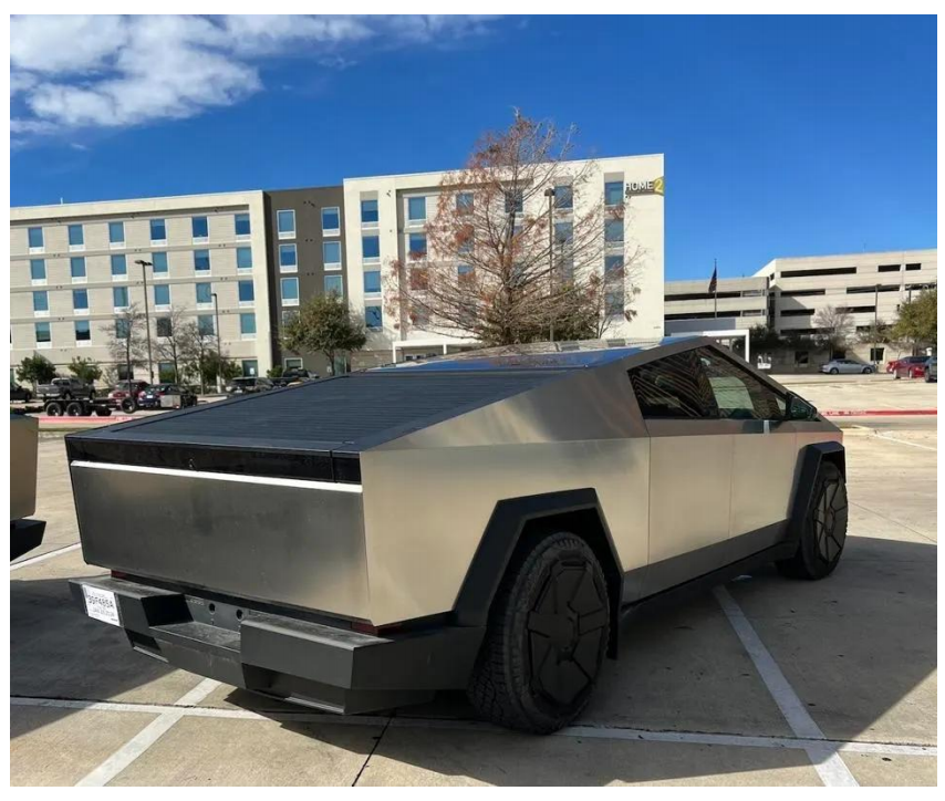
Beyond the failed demonstration, the Cybertruck’s design & price range is said to be disappointing. Most of Tesla’s fans criticized its impracticality and polarizing aesthetics. Fans were upset that the base model now costs $60,990 with a 250-mile range, far from the initially promised $39,900 and 500-mile range [25]. The sharp, angular lines were seen as impractical for a vehicle intended for rugged use, and the large size raised concerns about its suitability for urban environments and standard parking spaces.
Despite these criticisms, the Cybertruck garnered substantial pre-orders, indicating a significant interest in its unique design and features [26]. Despite the initial backlash, the Cybertruck has since become more accepted, with Tesla implementing numerous updates and improvements. While the Cybertruck continues to generate excitement and debate, it serves as a reminder that groundbreaking designs must also meet the practical expectations of consumers to be successful.
In recent years, discussions about design have not been limited to the works of renowned brands; bad design has also become a topic in public discourse and among social media influencers. These influencers often source examples from public forums, discussing a diverse array of design flaws. One of the most subscribed YouTubers, PewDiePie (youtube.com/@PewDiePie), created a series of videos between the year 2019 and 2022 where he reviewed poor designs featured on Reddit forums such as r/baddesign, r/crappydesign, and r/assholedesign (Figure 4). These videos attracted millions of views, with each video typically discussing multiple examples of flawed designs.
The mouse’s perfectly round shape, resembling a hockey puck, was widely regarded as impractical. This unconventional design quickly drew criticism for being uncomfortable and difficult to use, with many users and reviewers pointing out that prolonged use could cause hand strain and discomfort [19]. The small size and symmetrical shape made it hard for users to orient the mouse correctly without looking at it, leading to frequent misclicks and frustration. The backlash was significant enough that Apple eventually replaced the Hockey Puck Mouse with a more conventional, oval-shaped mouse [20].
Microsoft Bob - Software Interface & User Experience
Microsoft Bob (Figure 2) was a software product released by Microsoft in 1995, known for its use of visual allegories aimed at making personal computers more user-friendly for beginners. It was designed to simplify the Windows interface for novice computer users, particularly those intimidated by the standard Windows desktop environment [21]. Microsoft Bob replaced the traditional desktop interface with a cartoon-like, home-themed interface. Despite its innovative approach, Microsoft Bob faced challenges, with Microsoft later emphasizing its focus on software rather than content [22]. Microsoft Bob faced significant criticism and failed to gain traction. The software’s design and usability have been subjects of scrutiny, with considerations for accessibility in digital technology highlighted by reports on the topic [23]. One of the main issues was that it required a relatively high amount of system resources, which made it slow and inefficient on the hardware available at the time. The market response was overwhelmingly negative, and sales of Microsoft Bob were poor. Microsoft Bob has since become a notorious example of a misguided product in the tech industry, often cited in discussions about failed software projects.
Tesla Cybertruck - Automotive Design
The unveiling of the Tesla Cybertruck (Figure 3) in November 2019 created a significant stir due to its unconventional, futuristic design that sharply contrasted with traditional truck aesthetics. However, the event faced a setback when the demonstration of the vehicle’s “armor glass” windows failed as the glass unexpectedly shattered upon impact with a metal ball thrown by Tesla’s chief designer, Franz von Holzhausen, leading to doubts about the truck’s durability [24].
References
1. F. Ismail, S. Osman, and F. Rahman, “Ergonomics Kitchen: A Better Place to Work,” International Journal of Academic Research in Business and Social Sciences 11, no. 13 (2020). [CrossRef]
2. I. Reppa and S. McDougall, “When the Going Gets Tough the Beautiful Get Going: Aesthetic Appeal Facilitates Task Performance,” Psychonomic Bulletin & Review 22, no. 5 (2015): 1243–1254. [CrossRef]
3. M. Ibrahim, F. Romli, H. Arep, E. Supeni, and H. Alli, “A Comprehensive 7M IoT Adoption Model: A Lifecycle Shift Paradigm,” International Journal of Advanced Technology and Engineering Exploration 8, no. 84 (2021). [CrossRef]
4. Milena Flessas, Vinicius Rizzardi, Guilherme Luz Tortorella et al., “Layout performance indicators and systematic planning: A case study in a southern Brazilian restaurant,” British Food Journal 117, no. 8 (2015): 2098-2111. [CrossRef]
5. Anders Warell, “Multi‐modal visual experience of brand‐specific automobile design,” The TQM Journal 20, no. 4 (2008): 356-371. [CrossRef]
6. S. Cheah, Y. Yang, and Ozcan Saritas, “Reinventing product-service systems: the case of Singapore,” foresight 21, no. 3 (2019): 332-361. [CrossRef]
7. Oya Demirbilek, and Bahar Sener, “Product design, semantics and emotional response,” Ergonomics 46, no. 13-14 (2003): 1346-1360. [CrossRef]
8. D. Şahin, A. Çalgüner, and H. Yavuzcan, “Design Awards as a Design Promotion Activity: International Design Awards,” Pressacademia 4, no. 1 (2017): 134–142. [CrossRef]
9. Cheng-Yi Lin, “The reputation-building process and spatial strategies of creative industries: A case study of product design firms in Taipei,” Environment and Planning A: Economy and Space 49, no. 1 (2017): 186-204. [CrossRef]
10. John Bruen, John P. Spillane, Jim Bradley et al., “Managerial representations of achieving a competitive advantage in architectural practices: a UK perspective,” Archnet-IJAR: International Journal of Architectural Research ahead-of-print (2022). [CrossRef]
11. D. Trudeau, “Disparate Projects, Coherent Practices: Constructing New Urbanism Through the Charter Awards,” Urban Planning 5, no. 4 (2020): 429–440. [CrossRef]
12. Ji Han, Pingfei Jiang, Min Hua, et al., “An exploration of the role of creativity in crowdfunding product design projects,” Proceedings of the Design Society 3 (2023): 535-544. [CrossRef]
13. Christian Remy, Silke Gegenbauer, and Elaine M. Huang, “Bridging the Theory-Practice Gap: Lessons and Challenges of Applying the Attachment Framework for Sustainable HCI Design,” in Proceedings of the 33rd Annual ACM Conference on Human Factors in Computing Systems (2015): 1305–1314. [CrossRef]
14. Stuart J. Hysom, Murray Webster Jr, and Lisa Slattery Walker, “Expectations, status value, and group structure,” Sociological Perspectives 58, no. 4 (2015): 554-569. [CrossRef]
15. Nirmal Kumar Acharya, Young-Dai Lee, and Jong-Soon Kim, “Design errors: Inefficiency or carelessness of designer?,” Journal of performance of constructed facilities 20, no. 2 (2006): 192-195. [CrossRef]
16. G. Robert, Edsel’s Law: How Bad Design Happens, in Design and Truth (New Haven: Yale University Press, 2010).
17. C. A. Bolstad, A. M. Costello, and M. R. Endsley, “Bad situation awareness designs: What went wrong and why,” in Proceedings of the 16th World Congress of International Ergonomics Association (2006).
18. B. Gardiner, “Learning From Failure: Apple's Most Notorious Flops,” Wired, February 24, 2008, https://www.wired.com/2008/02/gallery-apple-flops/.
19. N. C. Gravley, “Still Have an iPuck? iCatch Makes the Round Mouse Usable,” MacObserver, August 23, 2000, https://www.macobserver.com/newreviews/bc/00/000823icatch/000823icatch.shtm.
20. R. Srinivas, “Why People Couldn’t Stand Apple’s Hockey Puck Mouse,” Slash Gear, March 24, 2022, https://www.slashgear.com/810251/why-people-couldnt-stand-apples/.
21. Jeisson Hidalgo‐Céspedes, Gabriela Marín‐Raventós, Vladimir Lara‐Villagrán et al., “Effects of oral metaphors and allegories on programming problem solving,” Computer Applications in Engineering Education 26, no. 4 (2018): 852-871. [CrossRef]
22. D. Downes, “The medium vanishes?,” M/C Journal 3, no 1 (2000). [CrossRef]
23. Katie Ellis, and Mike Kent, “iTunes is pretty (useless) when you’re blind: Digital design is triggering disability when it could be a solution,” M/C Journal 11, no. 3 (2008). [CrossRef]
24. Y. Zhang, “Development and Trend Analysis of the Cybertruck,” Applied and Computational Engineering 66, no. 1 (2024): 27–33. [CrossRef]
25. T. Carter, “Disappointed Tesla Fans Took Aim at the Cybertruck Over Its ‘Cringe’ Launch, With One Even Saying Their ‘Dream Got Crushed’ by Its Unexpected Price Hike,” Business Insider, December 1, 2023, https://www.businessinsider.com/tesla-fans-slam-cybertruck-disappointing-launchand-unexpected-price-hike-2023-12
26. Y. Zhang, “The 4P’s of Marketing Mix Analysis: The Uniqueness of Tesla’s Strategic Marketing Tactics in China,” in Proceedings of the 2023 2nd International Conference on Economics, Smart Finance and Contemporary Trade (2023): 233–240. [CrossRef]
27. Pahola Thathiana Benavides, Jennifer B. Dunn, Jeongwoo Han et al., “Exploring comparative energy and environmental benefits of virgin, recycled, and bio-derived PET bottles,” ACS Sustainable Chemistry & Engineering 6, no. 8 (2018): 9725-9733. [CrossRef]
28. Meike Ketelsen, Meike Janssen, and Ulrich Hamm, "Consumers’ response to environmentally-friendly food packaging-A systematic review," Journal of Cleaner Production 254 (2020): 120123. [CrossRef]
29. Ziynet Boz, Virpi Korhonen, and Claire Koelsch Sand, “Consumer considerations for the implementation of sustainable packaging: A review.” Sustainability 12, no. 6 (2020): 2192. [CrossRef]
30. R. Kozinets, Netnography: Ethnographic Research in the Age of the Internet (London: Sage Publications Ltd, 2010).
31. R. Kozinets, Netnography: Redefined (London: Sage, 2015). [CrossRef]
32. Sarah Quinton, and Sally Harridge‐March, “Relationships in online communities: the potential for marketers,” Journal of Research in Interactive Marketing 4, no. 1 (2010): 59-73. [CrossRef]
33. Virginia Braun, and Victoria Clarke, “Using thematic analysis in psychology,” Qualitative research in psychology 3, no. 2 (2006): 77-101. [CrossRef]
34. Denitsa Dineva, “Mixed methods research Part 1: Collecting and analyzing social media textual data using netnography and thematic analysis,” SAGE Research Methods: Business (2023). [CrossRef]
35. Colin M. Gray, Yubo Kou, Bryan Battles, et al., “The Dark (Patterns) Side of UX Design,” in Proceedings of the 2018 CHI Conference on Human Factors in Computing Systems (2018): 1–14. [CrossRef]
36. H. Brignull, M. Leiser, C. Santos, et al., “Deceptive patterns – user interfaces designed to trick you,” Deceptive.Design, April 25, 2023. accessed April 25, 2023, https://www.deceptive.design/.
The canvas begins with the initial design evaluation, where assessors identify critical aspects of their design. This phase involves understanding who the users and target audience are, defining the primary purpose of the design, and outlining the specific problem the design intends to solve. Additionally, assessors are encouraged to consider stakeholders and their needs, ensuring that the design aligns with public expectations and perceptions. This approach helps in setting a clear direction for the design process and establishes a foundation for further analysis.
Next, assessors are required to input their design images and sketches into the canvas. We recommend including multiple perspectives and detailed views of the product designs. This step promotes examination of the design from all angles, encouraging assessors to pay attention to finer details and to be mindful of the overall coherence and functionality of their work. By visualizing the design thoroughly, potential issues can be identified and addressed early in the process.
Following the visualization, assessors proceed to a series of open-ended questions aimed at eliciting deeper reflections on their designs. Questions include: Does this design visually remind you of something? Do you think it could be perceived negatively? How do you think the product could benefit both users and the brand? Why do you believe this is the best way to market the product? These questions are designed to provoke consideration about the design’s visual impact, potential user perceptions, and the strategic approach to marketing the product. This introspective process helps in identifying strengths and weaknesses that may not be immediately apparent.
Assessors then move on to a set of yes or no questions, which are divided into three parts: user testing, ethics, and public perception. Under user experience and usability, questions aim to ensure that the design meets user needs and is easy to interact with. Ethics part addresses the moral and practical implications of the design. Public perception questions gauge the design’s likely reception and market viability. This structured approach ensures that all aspects of the design are thoroughly evaluated.
After answering these questions, assessors complete the final reflection and remarks section. Here, they consider how this experience will inform future design projects and outline specific actions to be taken following the assessment process. The questions aim to encourage assessors to consolidate the insights gained from the assessment and apply them to future work.
These questions would help designers and stakeholders systematically assess and reflect on their designs, ensuring they meet high standards of quality, functionality, and user satisfaction before being released to the public. Additionally, the canvas would serve as a valuable training tool for prospective designers, helping them develop critical evaluation skills and a deeper understanding of effective design principles.
A systematic way to analyzing the Bad Design Canvas involves categorizing the design flaws identified in the “Remarks” and “Final Reflection” sections into key areas: aesthetics, accessibility (safety), functionality, and monetary value. Each category can be rated based on the degree of compromise it can withstand without diminishing the overall quality of the design. A scoring system can then be applied, assessing the design’s ability to meet essential criteria in each category.
For instance, safety aspects - such as product stability or user protection - must score a perfect 100%, as these are non-negotiable and cannot be compromised. On the other hand, visual aesthetics may allow for some flexibility, where up to 20% compromise might be acceptable (e.g., simplifying colors or textures). However, an 80% adherence to the original design intent must be maintained to preserve brand identity and appeal.
This approach enables designers to identify which aspects of the design can be adjusted without sacrificing critical elements and helps prioritize revisions. By using this analytical method, the Bad Design Canvas not only aids in reflection but also serves as a decision-making tool, allowing teams to make informed compromises where necessary, ensuring that key functional and safety components remain intact while minor visual elements may be optimized.
Limitations of the Bad Design Canvas include the types of designs that can effectively use this tool. Currently, it is limited to product design and graphic design, which are visually easier to describe and assess. User Experience (UX) and User Interface (UI) designs, on the other hand, are more complex and layered, making them difficult to evaluate with a single-page canvas. This complexity necessitates multiple iterations and extensive user testing for UX and UI designs. However, the Bad Design Canvas holds significant potential for further development in the UX/UI field.
Bad Design Canvas has the potential to be expanded to encompass architectural design, particularly in the context of public space design. The primary focus is on designs intended for public use, rather than private designs that cater more to personal or specific group aesthetics. The Bad Design Canvas is particularly aimed at addressing unintentional design flaws, recognizing that the intentions of all stakeholders cannot always be controlled. By systematically identifying and addressing these flaws, the Bad Design Canvas ensures that public designs meet high standards of usability, functionality, and public acceptance.
Conclusion
Given the multitude of elements considered as bad design, we can define bad design as one that is disrupted in terms of visual and aesthetic appeal, accessibility, user safety, functionality, and monetary value. These flawed designs often result from either unintentional or intentional actions by various stakeholders, not just designers. Public posts on social media highlighting bad design usually stem from a desire to joke or express concern for user safety, regardless of whether the design is intentionally or unintentionally bad. This paper has primarily discussed intentional bad design created to benefit the companies producing it, as seen in business practices such as marketing. However, further research could also be conducted to explore different cases of intentional bad designs produced to benefit other groups of stakeholders, for example, from the perspectives of politics, law, environmental issues, and social issues, among other fields.
Using netnography as a method and online posts as the research subject, we acknowledge the limitations of this research. While internet posts may reflect real life, they are not real life. Conducting a face-to-face survey might yield different interpretations of bad design from the broader public. The definition of design is vast; what is perceived as bad in one design field may not necessarily be considered bad in another. Additionally, bad design tends to be associated with products intended for public use rather than customized designs tailored to the preferences of individual clients or groups.
Research on bad design is not new; however, we aim to introduce a new way of thinking that enhances our awareness, especially in the context of social media’s influence today. We live in a social media-driven world, and our design processes must incorporate this aspect.
The Bad Design Canvas we have developed is not a static tool. As society evolves, public perception and understanding of design will change, and so will the scope of various design fields. Consequently, this tool may become outdated. Nevertheless, we strongly encourage ongoing research on bad design and mindfulness about it. It is crucial to continuously update academic knowledge on bad design to ensure that we provide designs that are always good, useful, and beneficial to society at large.
Author Contributions
Both authors contributed equally to this work. Savira Aristi and Virliany Rizqia Putri collaboratively conceptualized and designed the research, performed the netnography, and analyzed the results. The manuscript was jointly written and revised by both authors. They also shared responsibility for addressing reviewer feedback and finalizing the paper for submission.
Funding
Not applicable.
Acknowledgements
The authors would like to thank the Reddit communities and contributors whose discussions and insights provided the foundation for this study. We appreciate the openness and diverse perspectives shared on the /r/BadDesigns/, /r/CrappyDesign/, and /r/AssholeDesign, which were invaluable to our research. This research adheres to the platform’s policies and ethical guidelines for the use of publicly available online data.
Conflicts of Interest
The author declares that they have no conflicts of interest related to this research.
